
Like all good projects, SEO needs to start with a plan. To be a truly successful campaign, it needs to start with the data that’ll point you in the right direction from day 0. Before you’ve typed your first letter of content, you should already know that the best case scenario outcome is financially viable.
Leading on from that, you should also be clear on which terms bring you the best effort:result ratio and how to measure ‘success’.
With so much data and so many variables involved, it can be tough to compile all of this into a meaningful format. That’s where our Keyword Opposition to Benefit (KOB) template comes in. You enter a list of relevant competitor keywords and some base metrics, then the template gives you the projections you need to see.
To take it a step further, you can also enter your month on month traffic and lead volumes to see how your actual results track against those projections over time. Doing work without measuring results leaves a lot of potential revenue on the table.
Below, you’ll find an overview of how to use this template and what you’re looking at on the dashboard.
Note: This file relies on data from Ahrefs or SEMrush. Both are paid SEO platforms, neither of which we are affiliated with.
The Dashboard
Consisting of 6 graphs that use the metrics you’ll put into the rest of this sheet. The first 3 graphs give you the best-case scenario for traffic, leads, and revenue if you were to write and rank every piece of content in the 1st, 2nd, 3rd or 4th spot on Google.
Taking the statistics for each keyword, conversion rate and LTV we can return monthly numbers for each of the metrics below. These graphs represent the best case scenario for you when considering engaging in an SEO-led content strategy.
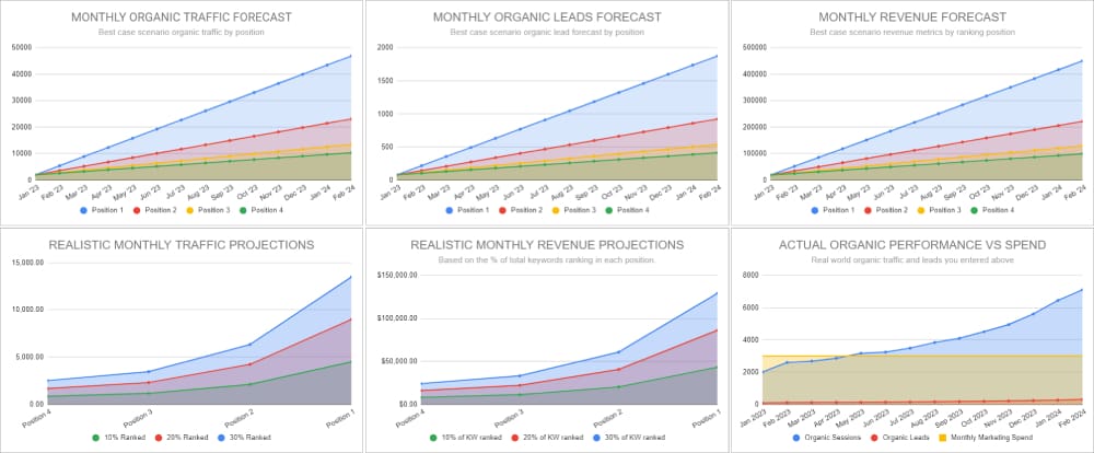
The bottom 3 graphs give you a more realistic view of ranking returns. More realistic because they expect that at any given time you will only be able to rank between 10-30% of your target keywords in the top 4 spots of Google.
Each line in the graph represents a ranking scenario between 10 and 30% and each mark on the X-axis represents the position you keywords are ranking at minimum. The final graph shows your actual performance so you can measure it against the projections presented here as you engage content marketing.
At the top of the dashboard sheet you’ll see the yellow table below. We’ve added dummy data to it but if you enter your own data here as the months go on and you get results the graph will fill in for you and allow you to use this in reporting.
Monthly organic traffic forecast
This chart shows your best case scenario if you were to improve your ranking to position 1, 2, 3 or 4 for all the keywords you’ve entered.
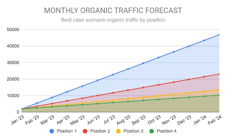
What you’re looking at here isn’t attainable metrics, it’s a snapshot of your absolute ceiling if you were to target the keyword set you’ve entered. If the numbers you see here are lower than you would deem to be a feasible end result, you’ll need to look at a different strategy or at least a new keyword set.
Monthly organic leads forecast
Following on from the previous chart, this one gives us those same metrics but for organic leads rather than traffic.
These metrics are based on the average conversion rates you entered.
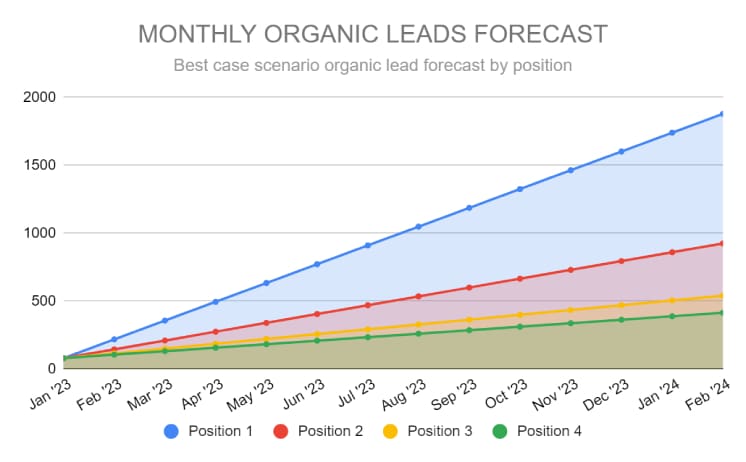
<(Projected Traffic * Website Conversion Rate)
Monthly LTV forecast
Marketing is about revenue. This third chart shows what these ceiling metrics look like as bottom line figures—the total amount of LTV revenue you could possibly make from this keyword set.
((Projected Traffic * Website Conversion Rate) * Lead Conversion Rate) * LTV
At any point on the graph below you can see the lifetime value generated monthly from your content marketing efforts. 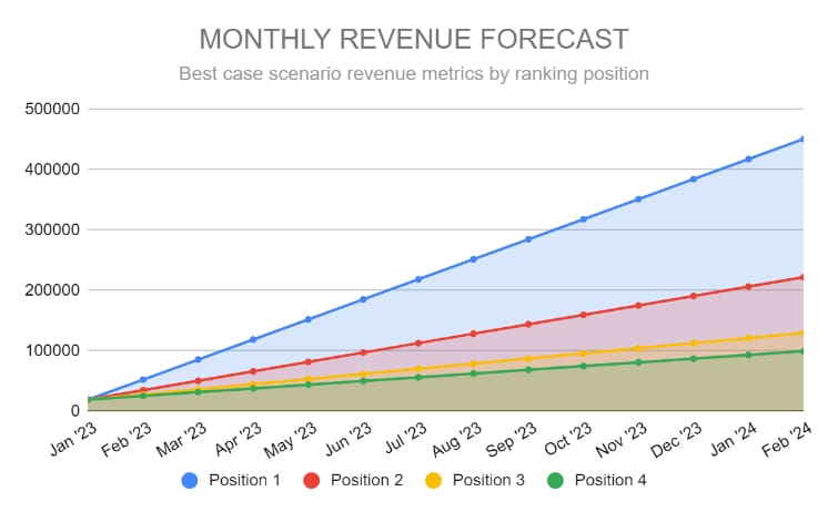
Realistic monthly traffic projections
From the small nimble content team to the 80 person strong freelance writer organisations like Zapier. No one ranks in the first position of Google for every keyword they target. The following 3 graphs are based on that fact. Unlike the first graphs these give you traffic, leads and revenue projections based on ranking somewhere in the top 4 results for between 10% to 40% of the keywords you added into the KOB sheet.
These are best used to help tamper and set expectations for you and your team when looking at realistic returns. Especially in the beginning. When trying to rank for just 10% of your keywords in the top 4 spots of Google is a tall order.
Each line in the graph represents a ranking scenario. That ranking scenario changing by how many keywords from the previous KOB you have in positions 1-4 (depending on the X-axis).
For example, if you ranked #4 for 10% of the keywords entered, you would get X traffic. This can be compared against ranking #3 for 20% of those keywords to see just how much of an influence you can have with relatively mild improvements.
Clarity Over Chaos
Content doesn’t need to be complicated. We help you simplify and scale what works.
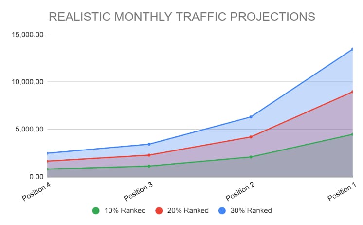
(Total Monthly Search Volume * Avg Google Click-Through Rate) * % of Terms Ranked
When in table form below it makes intuitive sense. The first point on the graph below corresponds to the highlighted cell here. The 2nd column indicates that you have 10% of your keywords from the KOB tab ranked in at least Position 4 of Google. If that is the case you can expect somewhere along the lines of just over 900 visitors to your website per month. If 20% were to rank you’d get approximately 1,800 visitors monthly and so on.
Realistic monthly revenue projections
Realistic LTV revenue projectsion follow the same logic as the above traffic projections. Each colum in the below table corresponds in colour to the graph showing how the revenue projections for each ranking scenario change depending on the average minimum position that you have achieved.

Again, this is based on the average LTV you entered and accounts for that natural attrition from website visitor to paying customer.

((Total Monthly Search Volume * Avg Google Click-Through Rate) * % of Terms Ranked) * LTV
Actual organic performance vs spend
Last but not least, this chart is a visualization of the traffic and leads you’ve actually generated through Google search. This is compared against your monthly marketing spend to see where that ‘break even’ point occurred or how far you are from achieving it.
While it’s normal to run at an initial loss, SEO should represent an asset long term, running you a net profit.

Setting up the template (it’s easier than it looks)
Now that we’ve covered how this template works and what all the charts and data mean, it’s time to start setting it up. Thankfully, there’s not much input required so the complete setup should take a matter of minutes.
Here’s what you’ll need:
- Access to either Ahrefs or SEMrush
- Last months organic traffc numbers from your Google Analytics or similar tool
- Your website conversion rate
- Your average customer LTV
- Customer conversion rate
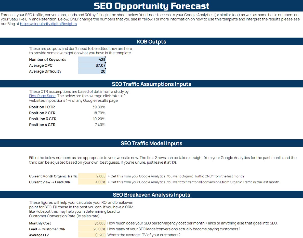
Enter your base metrics in the ‘Start Here’ tab
This tab sets up the basis of your projection models later on.
All you need to do is enter the required data marked in yellow for both the “SEO Traffic Model Inputs” and “SEO Breakeven Analysis” sections. A brief explanation of each is provided.
Paste this data into your KOB file
https://www.youtube.com/watch?v=XVJlKtf5N-AWith this data compiled and reviewed, it’s time to drop it into your KOB file so you can begin the analysis.
Note: Don’t sort of filter any of this data until all below fields have been entered.
Paste these into the KOB section of the sheet. You will need:
1. Keyword
2. Volume
3. Keyword Difficulty (KD)
4. CPC
5. Traffic Potential
To simplify this part of the process, these column headers are shown in blue.
Identify Keyword Intent
In the KW Intent column, select the most appropriate level of intent for each keyword. Based on the intent behind that search term, you’re looking to identify how close these users are to becoming a paying customer.
Let’s pretend you are the founder of a marketing receivable software like Quickbooks and explore some keyword intent examples.
Keyword intent examples
| Keyword | Intent | Reason for Intent Score |
| timesheets | Very Low | There are endless reasons someone may search for this generic term. Looking to see where it is in the country, driving directions, accommodation planning, ZIP codes, history etc. |
| invoice template | Low | Relevant keyword to your business but not dripping with immediate intent to use software. They may need a template for a one off solution or just looking for inspiration on how to format an invoice properly. |
| invoicing software | High | This is what your do. High intent but not VERY high as this might indicate tehy are comparing solutions and it doesnt reaveal much about their need. The customer could be a small business with 30+ people or a freelancer with no staff. |
| small business invoicing software | Very High | The intent for this search term is clear. This is a small business looking for a solution for their specific needs. |
| [competitor brand] | Low to Medium | It’s common for many SaaS to try to capture traffic going to bigger competitors by ranking for their brand also. The intent for this is generally very low (in the case of searches for brand name only) to medium at best (in the case of comparisons ie [competitors 1 vs competitor 2]). It’s generally ok to chase the comparison keywords and not the brand-only keywords. |
To speed this process up, you can use Ctrl+F or column filters to do this in large blocks rather than having to go 1 row at a time. For example, you could mark all search terms that include the words ‘price’ and ‘cost’ as High Intent.
Take a look at Hubspot’s overview of user intent in SEO for a more detailed look at how to make these decisions.
Next steps
With these fields filled out, you can head over to the Dashboard page and see what these metrics mean for your brand. They should give you the projections you need to see whether or not this is a viable angle for your business and start prioritizing that workload.
The dashboard is also where you can enter your month on month metrics from Google Analytics, too.
This template works great to survey your industry’s search landscape but it can also be repeated for each specific phase of your project. If you’re launching a new product or feature, just create a new copy of the template and run through the process again with search terms related to that new product. This is a simple way to make sure those projections show the traffic and revenue figures you need before you start.
It’s all about simplifying this early decision-making phase and demonstrating the degree of opportunity. This is a process we’re regularly expanding so if there are added features you’d like to see in the template, we’d love to hear about it. Just send us a quick message now and we’ll take a closer look.
Clarity Over Chaos
Content doesn’t need to be complicated. We help you simplify and scale what works.