
Unclear feature pages are costing you money: they leave potential customers confused, lower conversion rates, land your sales team with poorly-qualified prospects, and hamper your SEO and GEO performance.
Feature pages are critical communication channels between your company and the market. If you are having trouble getting buyers to understand your product, your feature pages usually fail to clearly articulate your value and relevance to their specific needs.
In this article, you will know how to transform your feature pages into powerful evaluation tools that generate qualified leads and drive revenue.
What a Good SaaS Feature Page Actually Does
Good feature pages don’t just describe functionality, they actively facilitate evaluation for humans and algorithms alike.
For buyers, your feature page has one job: helping them quickly decide if your feature solves their problem. More than an exhaustive capabilities list, they need clarity about whether your product meets their need.
For algorithms, feature pages represent your best chance for systems like ChatGPT, Claude, Perplexity and Google to understand what your product does from crawling. If done right, your product is visible and accurately represented in the different places buyers turn during their decision-making process
For sales and marketing, feature pages drive for qualified organic traffic via SEO and GEO and set accurate expectations.
When done right, the benefits of good feature pages multiply. Sales cycles shorten because buyers come pre-qualified. Lead quality improves as poor fits filter themselves out. And you appear in more relevant search results because you’ve clearly communicated who the feature serves and what problem it solves.
Why Feature Pages Drive Growth via SEO and GEO
When ChatGPT answers a question about your product, or when you show as a search result on Google, those systems are pulling from somewhere, and that somewhere needs to be your feature pages.
Here’s why this matters for your growth:
First, well-organized feature pages make it easy for SEO and GEO systems to understand your product, highlighting clear benefits, practical use cases, and value for potential buyers..
Second, how you structure these pages impacts which search queries you appear for. When you explicitly name your use cases and target audiences, you’re essentially telling search engines and AI systems, “Show us for THESE queries.”
Third, and the most critical point, they give you the chance to define your own product’s positioning. If you don’t, your competitors’ well-structured pages and comparison articles will serve as the benchmark, and you’ll be fighting an uphill battle against their framing.
These results combine to drive more qualified traffic, generate leads, and increase revenue. By clearly communicating your product’s benefits, use cases, and audience, you ensure that both AI tools and search engines present your product accurately, putting you in front of the right buyers at the right time and turning visibility into measurable growth.
Best Practices of a Good SaaS Feature Page
The best feature pages rely on clean messaging, logical structure, and visuals that clarify rather than distract. No fluff or hype needed.
Here are the core components your SaaS feature pages should include, starting at the top of your page and working our way down.
Start With the Problem
When a visitor lands on your page, they should immediately think, “This is exactly what I’m struggling with.”
To do this, your landing page should focus on specific pain points, leading with why the feature matters, not what it is.
Above the fold, include:
- A headline that names the problem
- One or two supporting sentences that validate the pain
- A simple product visual or short looped video that shows the outcome
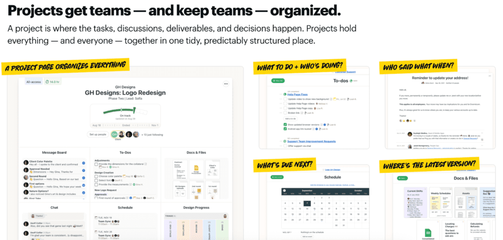
Basecamp’s projects feature page leads with a clear promise in the headline: projects are what keep teams organized. The supporting sentence explains why by defining a project as the single place where tasks, discussions, deliverables, and decisions live together. Instead of abstract claims, the visual shows exactly how that organization looks in practice: one project containing to-dos, message boards, schedules, and files, alongside callouts that answer common team questions like what to do, who’s responsible, what’s next, and where the latest version lives. By showing how everything related to a project is grouped in one structured space, the page makes the value of Projects immediately understandable
Explain How Your Feature Works
After establishing the problem your feature solves, you need to tell your potential customer “What will happen when I use this feature?” –– not “What settings can I adjust?”
This is because, at this stage, the buyer is still trying to understand the outcome, not the mechanics. They’re asking, “If I turn this on, how does my day get easier?” not “Where do I click?” or “What options do I have?” Leading with settings forces them to do mental work too early, before they’ve even grasped the value. Explaining what happens when the feature is used helps them build a clear cause-and-effect story in their head, which is how people decide whether something is worth their attention in the first place.
That’s why this section often relies more on visuals than dense copy, for example:
- A single well-chosen screenshot with annotations
- A 30-second video showing the feature in action
- A simple diagram that makes complex workflows clear
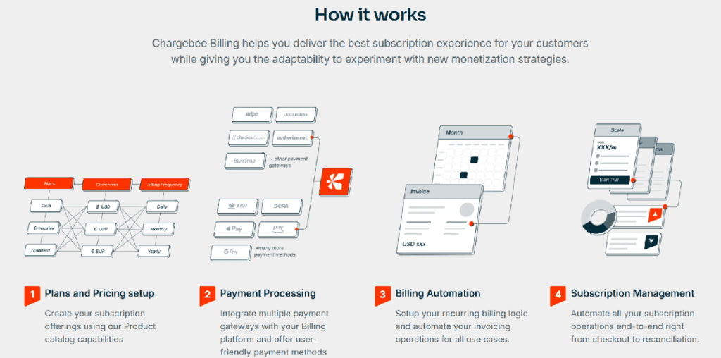
Chargebee’s subscription billing feature page shows what actually happens when you use the product. The visuals walk the reader through a simple sequence: you create billing plans, connect payments, then let billing and subscriptions run automatically. Each step is packed with useful detail—you can see things like multiple currencies, different payment processors, and real configuration options—so the reader understands the scope without reading long explanations. By presenting the flow in a clear order, the page helps buyers grasp how Chargebee handles subscription billing before worrying about setup or feature lists. It makes a complex system feel easy to understand at a glance, which is exactly what this part of the page needs to do.
Define Who Your Feature Is For
Your feature pages should clearly state who the feature is designed for, including specific roles, team types, company stages, or use cases.
Because when buyers see themselves clearly described, confidence increases. When they don’t, they might choose to move forward on another product rather than enter a sales process that may lead nowhere.
In practice, this means adding:
- Simple role callouts (“For product managers who need to keep specs, feedback, and decisions in one place”)
- Specific use-case examples (“Use Projects to run a product launch, coordinate a client redesign, or manage an internal roadmap”)
- Team-specific sections (“How marketing teams use Projects” or “Projects for client services teams”)
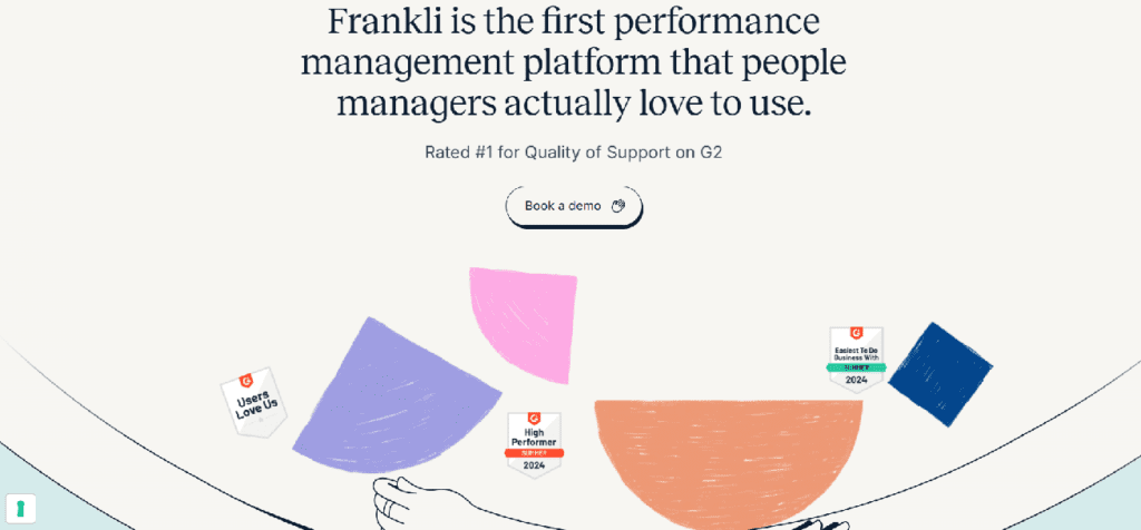
Frankli’s engagement feature page defines its audience immediately by calling out people managers. Instead of leading with generic HR or performance language, it clearly states who the product is for and anchors the value in their day-to-day reality. The phrasing makes it obvious that this isn’t a tool for executives or HR administrators alone, but for managers who are responsible for running feedback, performance conversations, and engagement on their teams.
Add Context, Constraints, and Tradeoffs
One of the biggest differences between average and excellent feature pages is context. Your prospects are making complex buying decisions, and clarity matters. They don’t just need to understand what a feature does, they need guidance on when it makes sense to use it and when it doesn’t. Providing that context reduces uncertainty, sets the right expectations early, and helps buyers decide with confidence instead of second-guessing later in the funnel.
Be explicit about:
- Which pricing tier includes this feature
- The company size or user volume where it delivers most value
- Any technical prerequisites or implementation requirements
This transparency improves the quality of your pipeline. . Buyers aren’t looking for perfect solutions; they’re looking for honest vendors who respect their time. Even AI systems evaluating your product will reward clear constraint disclosure over vague implications.
Keep this section primarily text-based, though a simple checklist or highlighted box can make these details more scannable.
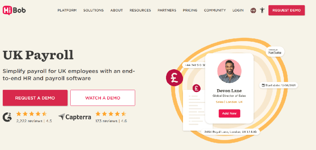
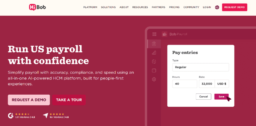
HiBob’s payroll feature pages are a strong example of adding context, constraints, and tradeoffs directly into the page structure. Instead of presenting “Payroll” as a single, universal feature, HiBob splits it into clearly defined, location-specific pages like UK Payroll and US Payroll. Each page makes it clear where the feature applies.
This approach quietly answers critical buyer questions without a long explanation. If you’re a UK company, the UK Payroll page signals a strong fit. If you’re in the US, there’s a dedicated page for you as well. And if you’re based elsewhere (such as the EU) the absence of a tailored payroll page acts as an honest constraint, helping buyers self-qualify early.
Reduce Ambiguity By Showing Proof
Effective feature pages show what the feature looks like in real use, not just what it claims. Any product can say they give an abstract benefit like “saving time”, but buyers want real proof.
Visually, this is a great place for:
- Real product screenshots in context
- Step-by-step UI flows
- Statistics and real customer quotes from your case studies
- Short captions explaining why the example matters
You don’t need to lay out a whole case study here, but you do need concrete evidence to invite a prospect to insert their business into your story.
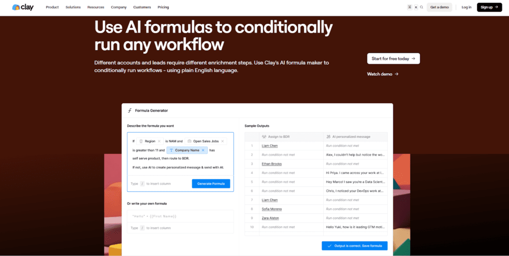
Clay’s AI formula generator feature page is an example of this principle in action. Instead of describing conditional workflows abstractly, it shows the actual interface where users define logic, preview outcomes, and confirm results. The side-by-side layout turns a complex capability into something understandable.
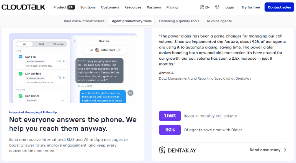
CloudTalk’s feature page is also a good example, as they add statistics and real customer quotes pulled directly from customer stories. Instead of relying on generic benefit statements, the page highlights concrete outcomes. By grounding each claim in a specific result and a real customer voice, the page reduces ambiguity and builds trust. Prospects don’t have to imagine whether the feature works; they can see evidence of how it performs in real teams. This kind of lightweight proof invites buyers to picture similar results in their own business, without forcing them to dig into a full case study before they’re ready.
Guide Buyers Deeper Into the Product
An individual feature page describes only one part of your product. If someone is compelled enough to move through one feature, they are seriously considering your product, so point them toward related features, technical docs, or use cases.
This might mean:
- Adding “Related features” sections
- Embedding contextual links within your copy
- Placing select in-text links when describing features and solutions
- Creating separate paths for technical and business users
This strategy serves double duty: it improves user experience and strengthens your site’s internal linking structure for SEO.
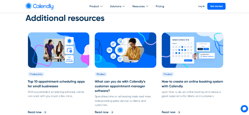
Calendly feature page is an example of this approach. After positioning the product for a specific audience, the page introduces an “Additional resources” section that links to related guides and feature explanations. These links deepen understanding without interrupting the main page flow, allowing different buyer types to explore at their own pace. This keeps the feature page focused while still creating natural paths into the rest of the product and content ecosystem.
Choose the Right CTA
There’s no single “best” CTA for a feature page. What you choose will depend on your business model and the audience of a particular feature.
For example, if you are running a sales-led organization with no self-serve option, you might always direct visitors to your sales team. But if you’re offering multiple paths (free trials, demos, sandboxes), you need to be strategic.
The best feature page calls to action do three things exceptionally well:
- They match CTAs to where buyers are in their journey
- They resist the temptation to present too many equal options
- They position CTAs as logical next steps, not desperate conversion attempts
The key point is that your feature page guides qualified prospects toward the specific action that makes sense for them.
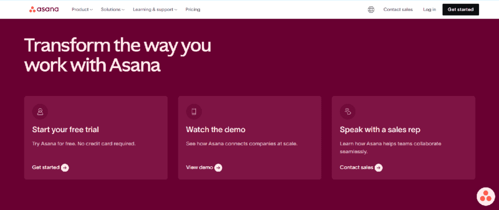
Asana’s project management feature page shows how to handle CTAs with intent. Instead of forcing every visitor down the same path, the page presents three clear options at the bottom: start a free trial, watch a demo, or speak with a sales rep. Each CTA maps to a different stage of buyer readiness: hands-on evaluation, low-commitment exploration, or high-touch sales conversation. This makes the next step feel logical rather than pushy, and allows their visitors to move forward in a way that matches how they want to evaluate the product.
Want Help Scaling?
Singularity Digital helps take SaaS between 1-3M ARR to 10M ARR in 2 years or less. We battle for the underdog brands – beating the big guys by being faster, better and unbreakable. Come join us.
Should You Include FAQs on a Feature Page?
Some teams strategically use FAQs to handle objections and give more product information without cluttering their main messaging. Others deliberately avoid them to maintain focus. Both approaches can deliver results.
FAQs create the most value when:
- Buyers consistently ask the same clarifying questions
- The feature has common misconceptions
- You want to support SEO without bloating the core content
- There are technical or legal details that need to be disclosed in more detail
But be careful not to introduce completely new functionality in an FAQ. All of your core feature components should be addressed as you describe it, not hidden in an expanding menu.
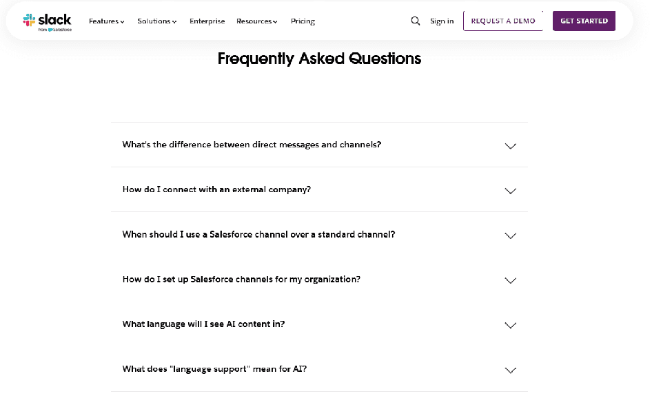
Slack’s Channels feature page is a good example of using FAQs deliberately and with restraint. The main page stays focused on explaining what channels are and why they matter for organizing work and communication. Once that foundation is clear, the FAQ section steps in to answer predictable follow-up questions that naturally come up from that narrative—such as how channels work for internal teams versus external partners, how they’re used with customers, and how channels connect with tools like Salesforce.
Importantly, the FAQs don’t introduce brand-new capabilities or surprise the reader with features that weren’t mentioned earlier. Instead, they clarify edge cases, usage scenarios, and integration details that buyers are already wondering about. This lets Slack reduce uncertainty, handle common objections, and pick up long-tail SEO traffic without cluttering the core messaging. The result is a feature page that stays clean and scannable, while still giving buyers the depth they need to move forward.
Design for Scannability and Comprehension
Finally, structure matters as much as content.
Buyers skim before they read. AI systems extract key points before they summarize. That is why your feature page needs to communicate value in seconds, not minutes.
That means:
- Clear headings that describe value
- Short paragraphs and intentional spacing
- Visual hierarchy that naturally guides the eye
- Good amounts of of white space
- Thoughtful use of video and looping demos
- Strong, branded graphics that clearly communicate benefits of your product and/or break up walls of text
Each section should be able to stand on its own, whether a buyer scrolls, skims, or only reads a single part of the page.
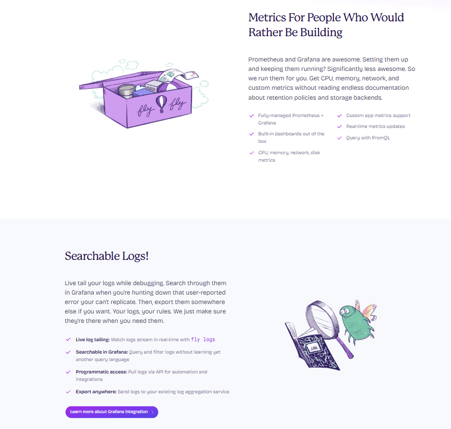
Fly.io’s monitoring page uses short paragraphs, and generous spacing to make each idea easy to absorb. Content is broken into distinct sections that stand on their own, so a buyer can skim, pause on a single block, and still understand the core value being communicated.
A big part of what makes this skimmable is Fly.io’s use of bullets and strategic bolding. Bullet lists surface key points quickly, and bold text highlights important phrases and concepts without turning the page into a dense wall of copy. This visual hierarchy naturally guides the eye from headline → explanation → supporting visual, letting readers see the structure of the argument without effort.
That layout doesn’t just help humans: it also makes the page easier for AI systems and search engines to parse and summarize.
Common Feature Page Mistakes to Avoid
Most feature pages don’t fail because the product is weak. They fail because potential customers can’t figure out whether the feature solves their problem. The following mistakes show up repeatedly across SaaS sites, and each one increases buyer confusion while weakening how search engines and AI systems interpret the page.
- Turning the feature page into a mini homepage — Cramming in company overviews, adjacent features, and platform messaging dilutes focus, frustrates visitors looking for one specific answer, and makes it harder for search engines and AI systems to understand what the page is actually about.
- Overloading on technical detail without context — Leading with implementation details before explaining value hides your feature’s true value. Effective pages layer information so the core benefits and technical specifications are both easy to find.
- Using vague or inflated benefit statements — Generic claims like “increase productivity” sound good but don’t help buyers evaluate relevance and result in generic search and AI summaries that make your product forgettable..
- Trying to persuade instead of clarify — Language that leans on hype, superlatives, or vague promises (“powerful,” “best-in-class,” “game-changing”) tends to create skepticism and blur understanding. Clear, neutral explanations, focused on what the feature does, when it’s useful, and what to expect, help buyers evaluate fit more confidently and are also interpreted more accurately by AI systems.
Why Most Feature Pages Fail
Most feature pages fail for the same reason: they’re written from the inside out. They reflect how the team thinks about the product internally, not how buyers encounter, interpret, and evaluate it from the outside.
That disconnect usually shows up first in the language. When feature pages rely on internal jargon instead of buyer-facing terms, prospects struggle to connect features to real problems. The result is broken clarity—buyers can’t easily map what they’re reading to their own situation, which quietly weakens conversion.
The same inside-out thinking leads teams to assume buyers already understand the problem the feature solves. When problem framing is skipped, features feel optional and low-urgency, especially for early-stage buyers who haven’t fully articulated their needs yet. Without context, even genuinely strong features can come across as nice-to-have rather than necessary.
Finally, this mindset often turns feature pages into static documentation. When pages aren’t updated as the product, market, and ICP evolve, they drift out of sync with how the product is actually sold and used. Over time, that gap erodes buyer trust and sends weaker signals to search engines and AI systems trying to interpret what the product is really for.
Checklist for Building a Feature Page That Works
- Is the problem clearly stated above the fold?
- Is the intended audience explicit and narrow?
- Is the feature explained conceptually before details?
- Are use cases concrete and buyer-driven?
- Are constraints or limitations acknowledged?
- Is the structure easy to scan, summarize and have a clear visual hierarchy?
- Are CTAs clear, contextual, and aligned with buyer intent?
- Would an AI summarize this page accurately and confidently?
Want Help Scaling?
Singularity Digital helps take SaaS between 1-3M ARR to 10M ARR in 2 years or less. We battle for the underdog brands – beating the big guys by being faster, better and unbreakable. Come join us.
Bottom Line: Feature Pages Shape How You’re Understood
Feature pages don’t just sit on your website, they actively shape how your product is interpreted, recommended, and evaluated, by buyers and in search.
When a feature page is clear, structured, and buyer-centric, AI tools can describe your product accurately instead of guessing. Search engines can match you to the right queries instead of broad, low-intent traffic. And most importantly, buyers can quickly tell whether your product aligns with their problem before a sales conversation ever starts.
This is where the real leverage is. Good feature pages reduce friction everywhere: fewer misaligned demos, shorter sales cycles, stronger inbound leads, and less reliance on sales to “re-explain” what the product does. They turn evaluation into something that happens naturally, without pressure.
For SaaS founders and product leaders, feature pages are not a copy exercise, they’re an alignment tool. When your feature pages clearly express what you do, who it’s for, and where it fits, you’re not just improving marketing performance. You’re making it easier for machines and humans to understand your product the same way your best customers already do.