Your SaaS product is great, right? Of course it is, or you wouldn’t have gone to market. The thing is, nobody else knows how great it is. You can join your competitors in screaming about yourself across every platform that’ll let you, but you’re just adding to the noise and nobody is listening unless you make an extremely aggressive (read: costly) push.
So, how do you get the cut-through that your brand needs for some real traction? The answer is ranking for the right search terms and offering the right info on your website in an intuitive format.
It sounds simple at first, but here’s the challenge. Your website needs to answer questions your visitors don’t even know they have yet. Most of them are on a journey of discovery and the more they learn, the more questions come up along the way. To turn your website into a lead-generating powerhouse, you need to guide them through this journey from ‘how do I solve x problem’ to ‘this brand seems like the best fit for me’.
Exactly how you implement this starts with a deliberate selection of the Saas landing pages on your website. I’m about to walk you through each of the 7 types of pages you need to satisfy the bulk of your user base and give them the guidance they’re searching for. By the end, you’ll have the tools you need to start planning this all out in a logical, actionable order.
TL;DR:
Your SaaS website needs to tell users everything they need to know, how your brand stacks up against competitors and why they should choose you. Failure to do any of these things will see them leave your site and rarely return. It’s your job to keep that from happening, and it’s my job to show you how.
Understand the problems your users are trying to solve
This needs to be the starting point for these internal discussions while you figure out a game plan. It’s not about “what do we want people to know?”, it’s about effectively showing up as the solution to your users’ problems.
The most common pain points, in no particular order:
- I have a new problem and I don’t know how to solve it
- My current provider isn’t a good fit (or isn’t a good fit anymore)
- I keep hearing about [your brand] but I don’t know what it is. I should look into it.
- We need to reduce expenses. Are there cheaper platforms out there that still do what I need?
- There are so many brands to choose from. How do I figure out the right fit for me?
- Can I integrate X process into my Y platform?
There will probably be some more niche-specific ones, but these are the general themes you’ll need to cover. The better your website can do this in an intuitive way, the greater engagement you’re going to see.
Meet the minimum or perish
To do this effectively, there are 7 types of landing pages that all good SaaS websites will have. To see examples of these in action for your niche, take a look at the websites of your strongest competitors.
You’ll quickly see what they’re doing effectively and how they’re using each of these page types to guide the user through their journey.
Those 7 different SaaS landing page types, which we’ll get into in more detail below, are:
- Product landing pages
- Industry pages
- Services pages
- Features pages
- Comparison pages
- Alternatives pages
- Integration pages
Product landing pages and supporting subpages
Easily the most obvious of the 7, product landing pages show off your product features and the key pain points it addresses. They explain why your product exists in the first place and how using it will make their life easier. You’ll want to use small blocks of text and offer plenty of visuals so this content is attractive and easy to consume.
Of course, the challenge there is providing enough information without every page looking like an essay. The best way to achieve this balance is by keeping your product pages succinct, then adding a second layer of pages that go into more detail for those who are interested.
We’ve all had that frustrating experience on a website before. You’re looking for a solution to a specific problem, you’re looking around and feel like you may have found the ideal product. They gloss over the exact feature you’ve been searching for. . . then they just move on. No more info, no details. Even worse, if you want to know more, you have to talk to the sales team? That’s a hard no.
So what do you do in that situation? You leave the website, go back to the search results and continue your search elsewhere. Even though that product may have been the ideal fit, there’s just no way to know without becoming part of their sales funnel.
That’s where these subpages come into play, making sure your website offers delight and engagement rather than frustration.
Industry pages
Most SaaS products have a collection of different use cases, generally based on different industries. For example, if you’re a time tracking platform, the way a freelance writer uses your product will be very different to how a marketing agency may use it. That agency would use it in a completely different way to a law firm and so on.
By creating separate pages for each of your core industries, you’re creating content that’s so much more engaging and informative to each of those users. Rather than being limited to talking about your offering in general terms, you can offer recognizable screenshots, address their specific paint points and mention the integrations that are specific to them.
Ultimately, these industry pages allow you to make it clear exactly how much easier their life could be with your software.
Services pages
Most of your customers are aware of the problems they’re facing but won’t necessarily know the solutions available to them. Services pages help guide them through this part of their journey.
Rather than talking about their industry or specific product features, these pages focus on a specific problem or task they’re trying to achieve. MailChimp does a great job of this at the top of their navigation structure.
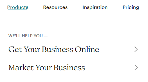
For users looking to expand their reach online, these two options are clearly relevant to them with zero prior knowledge. If I’m a user that’s looking for ways to market my business, these nav labels alone make it clear to me that MailChimp understands my problem and presumably has a solution. Clicking that nav item is pretty compelling.
As for the type of content that goes into a service page, stick with the top-level problem solving. Now is not the time to talk about your product features.
If you’re a digital reporting platform, this is where you talk about the problems that clear, automated reporting can solve for your customers. How they can pull data from multiple sources and present it in an intuitive way for efficient meetings
and effective decision making. You want people to visit this page and get FOMO, feeling as though they need this solution because their current setup is a comparative gong show that’s wasting time and money.
It’s all about the problems you’re solving and the benefits being provided. If people want to know more about exactly what platforms you integrate with, link to a page Features page that talks about your integrations. If they want to know more about how your platform works for their industry, link to an Industry page that gives them screenshots and examples of that.
See how this is all starting to come together and provide a complete, informative journey?
Features pages
This is your opportunity to go into more detail about each of the key features of your product. As you might expect, Ahrefs does a great job of this in the SEO space.
Their platform is far too vast to cover on a single page and they understand that not everyone necessarily cares about every function. So, their Tools menu offers 6 different feature pages, showing off the 6 primary features their users might want to know more about.
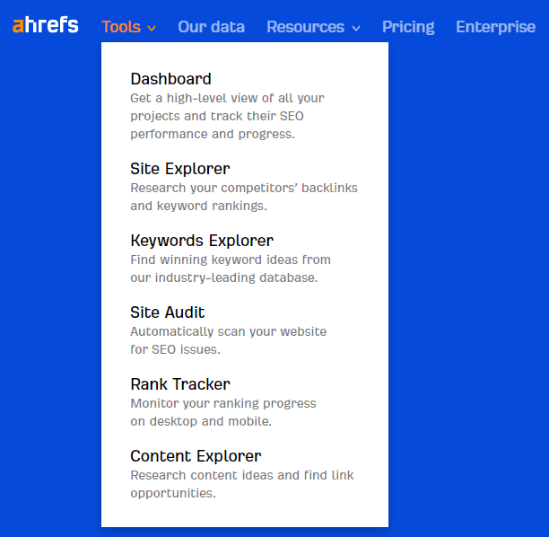
Using this site structure, their home page gives me an overview of what their platform can do. If I want to know more about their Rank Tracker, for example, there’s a whole feature page dedicated to the ins and outs of exactly how that works.
Remember, these pages should be driven by user intent and search volume, not by what you want them to know. The idea is to showcase the chosen features in enough detail to be informative while keeping it succinct. Screenshots, gifs and videos can be far more effective than blocks of text at getting this point across.
Pages Your SaaS Needs
You don’t need more pages, just the right ones. We break down which landing pages matter and why. If you want to talk through your site and see what’s missing, book a call.
Comparison pages
When your audience is on a discovery journey, they’re taking in a lot of new information quickly. They’re seeing page after page of self-promotional content claiming that every brand is the “best” at everything and it gets exhausting.
Comparison pages become a powerful tool here, empowering the user to see for themselves whether your brand is right for them. Using your dominant competitors as a helpful reference point, you can demonstrate the pros, cons and relative value of your platform.
A simple comparison table showing features and pricing can go a long way to helping a user make the buying decision. These decisions are always made around value propositions, not sheer feature volume. If you’re 20% cheaper than a competitor but offer the same core functions without the nice-to-haves, this can be a huge selling point for many. In the same way, if you’re 20% more expensive but offer a lot more value, this comparison makes that added value very clear.
From a purely SEO perspective, these comparison terms show too much relevant search volume to ignore. Look at the monthly searches for ‘quickbooks vs xero’ terms in the US alone.
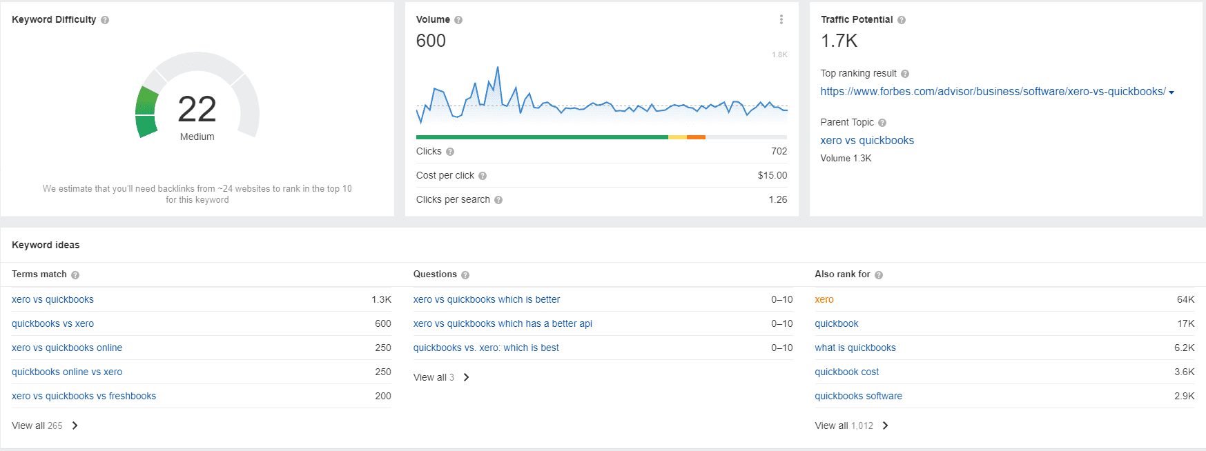
While your industry may not have quite that volume, it shows that there’s an appetite for this type of comparison and it’s helping users make those buying decisions. Crucially, it’s helping them make that buying decision for themselves without ever having to say you’re the “best”. Show them how you stack up and let them be the judge.
Pro Tip:
One way users look for a better version of a platform is by using ‘vs’ terms. For example, searching for “Salesforce vs” will show a bunch of results for platforms that compete directly with Salesforce. Comparison pages help you appear for these types of searches, especially if you include [major competitor] vs [your brand] on the page.
Alternatives pages
While comparison pages help users make a direct comparison between your brand and a specific competitor, an alternatives page broadens the scope.
There are a few different situations where this page can be helpful to your audience:
- They’re already using a competitor’s product but it’s either too expensive or offering a poor experience
- They’re early in the discovery journey and know the top brands but want to get an idea of who else is out there
- They’ve heard of the enterprise-level solutions but need a more suitable product for their business size and budget
In all three of these use cases, you obviously want to show up as a quality solution they should look into.
If you have access to a keyword research tool, take a look at the keywords “alternative to” and see what comes up. The bigger your industry and competitors, the more likely you are going to have one of these searches for your industry.
These terms are so popular that there are websites like alternativeto.net that exist purely to offer platform alternatives. Their site is incredibly strong and currently has 3.35 million backlinks. That’s 3.35 million occasions where other websites have found these alternatives to be worth referencing.
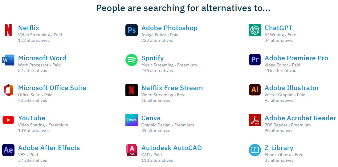

An effective alternatives page should give the user a quick overview of how each of the brands stack up. Simple, easy to consume content that helps them identify the top brands they should investigate further.
Visual elements are a must for this type of page. For example, screenshots, video or gifs of each platform in use and comparison tables to show a comparison of important features and price.
It’s also helpful to include a short blurb about how each platform functions and who they’re ideal for. Unlike comparison pages, you don’t want to go into too much depth here or people will just stop reading.
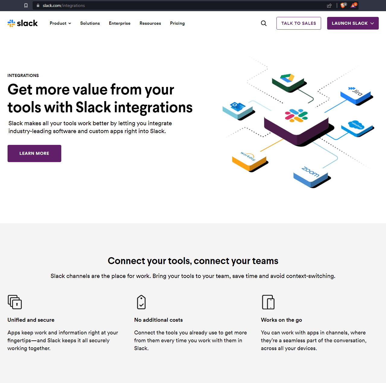
Integration Pages
In short, integration pages show off the integrations your platform has with other brands they care about. It demonstrates even more value to users and potentially even shows them where they can be saving on their tech stack expenses if they migrate to your brand.
These pages are immediately beneficial for users that are already using your website. Beyond that, they also offer an opportunity to drive additional bottom-of-funnel organic traffic with lower effort.
Initially, you can start to rank for terms like “best [brand name] integrations”, when people are looking for platforms that integrate with their current tools. As an example, “best slack integrations” gets 150 searches per month, along with a host of similar terms. All up, that’s a few hundred searches per month that you could be appearing for, just by leveraging the strength of a brand you integrate with.
Depending on the top results for these search terms, you may even want to put a ‘best of’ style blog post together that covers the top integrations. . . which will of course include your own brand.

As you establish more brand presence in your industry, you’ll start to see people searching for what you integrate with as well. “[brand name] integrations” will start to grow in search volume and bring warm, motivated users to exactly what they’re trying to find. The best part is, ranking for these terms will be incredibly easy as it’s focussed around your own brand name.
For Slack, “slack integrations” currently sees around 1,300 searches per month for that one term alone and earns an estimated 6,600 monthly visits. Granted, Slack is a big and well-known brand but even if you got 10% of this, that’s still free traffic for minimal effort.
By producing these SaaS landing pages for your website, you’re taking it from a glorified brochure to a genuinely helpful, effective part of your sales funnel. Helping users understand the offerings available, how your brand helps their bottom line and how to sell it to their internal stakeholders.
You’re also adding significant SEO benefit by producing targeted, high-quality content across at least 7 different pages. This gives search engines a far better handle on what you offer and whether or not it satisfies searcher intent.
Arrange these pages in an order of priority that makes sense to you. After some basic competitor research, start putting these pages together one at a time and measure the result. You’ll be surprised how much of a difference these landing pages will make to your marketing efforts.
Pages Your SaaS Needs
You don’t need more pages, just the right ones. We break down which landing pages matter and why. If you want to talk through your site and see what’s missing, book a call.