TL;DR
- Comparison pages capture high-intent buyers already deciding between tools, often converting 2–5x better than general content.
- If you don’t create the comparison page, review sites, blogs, or AI summaries will define the narrative for you.
- Focus on real decision factors like pricing, integrations, onboarding, and ideal customer fit rather than listing every feature.
- Explain how differences impact real workflows and outcomes, not just the feature set.
- End with a clear, contextual CTA that reinforces your differentiator and guides the buyer’s next step.
When someone searches for “YourBrand vs Competitor,” they’re no longer exploring options; they’re deciding between finalists. That makes comparison pages some of the highest-intent traffic in SaaS –– even with lower search volume, comparison pages can drive 2–5x higher conversion rates because they capture highly qualified buyers at the exact moment they’re making a decision.
Your buyers are already comparing your product to competitors, whether you participate in that conversation or not. And if you don’t create that page yourself, the narrative gets defined somewhere else; on review platforms like G2, comparison blogs, or AI-generated summaries. Here’s how to build your own comparison page to give buyers accurate information about your product, highlight your differentiators, and pre-qualify your sales pipeline with better-fit customers..
3 Questions Your Buyer Wants Answered From Comparison Content
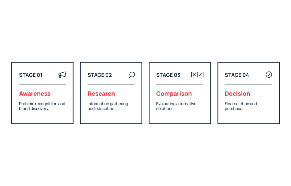
Comparison page readers are towards the bottom of your marketing funnel, looking for information that removes uncertainty to help them make a decision. So a strong comparison page answers the questions your buyers ask while evaluating tools they are seriously considering.
“Does this solve our specific technical requirements?”
If your tool doesn’t fit a buyer’s technical requirements, you will never make the sale. Honor your reader’s time and improve the quality of your sales pipeline by being specific about integrations, permissions, scalability, compliance, and workflows instead of relying on vague claims like “robust” or “powerful.”
Clear details reduce friction and make it easier for buyers to quickly confirm that the tool fits their environment. That clarity matters because B2B buyers spend only about 17% of the total purchase journey meeting with potential suppliers, meaning most evaluation happens through independent research and content before sales conversations begin.
“Is this built for a company like ours?”
People procuring software need to know your tool will work for their company size, industry, and operational complexity. A startup might prioritize speed and simplicity, while enterprise teams often care more about governance, security, and support. Address the needs and concerns of your ICP clearly so readers can quickly tell whether your solution will work for their situation.
“Will this work for us long-term?”
Buyers aren’t only evaluating whether your tool works today, they’re thinking about whether it will still work tomorrow. Your buyer may have growth on the horizon, international expansion, a new vertical, or even be expecting volatility and potential contraction.
Where you have the ability to meet a company at different points in their trajectory, show this clearly. Maybe that’s proving you have the technical capacity to scale support tickets, flexible pricing options and contracts that support a change in company size, or integrations that support a growing tech stack as the company adds new tools. The goal is to demonstrate long-term viability without relying on vague claims like “unlimited scalability.”
Which Type of Comparison Page Should You Use?
Not all comparison pages serve the same purpose. They’re often part of a broader product-led content strategy designed to help buyers evaluate how software fits their workflows. Different formats help capture different types of buyer intent and can support both marketing and sales conversations.
Direct “YourBrand vs Competitor” Pages
These pages capture high-intent branded search traffic from buyers already comparing two specific products.
Keep these pages focused on 5–7 real decision factors like pricing, integrations, onboarding speed, or reporting capabilities rather than listing every feature. The goal isn’t to prove you win everywhere, but to highlight the core differentiators that matter most to your shared audience.
Best for: SaaS companies whose buyers frequently compare their product with a specific competitor during research, sales conversations, or demos.
Competitor vs Competitor Pages (Strategic Leverage)
Competitor-vs-competitor pages target searches like “CompetitorA vs CompetitorB,” capturing traffic around tools with higher brand awareness.
Because your product isn’t the focus, the comparison needs to stay neutral and factual to maintain trust. By presenting an objective breakdown of both tools, you position your site as a credible resource while still introducing buyers to your product as another option.
Best for: SaaS companies with lower brand awareness that want to capture comparison traffic around better-known competitors.
Anatomy of a SaaS Comparison Page
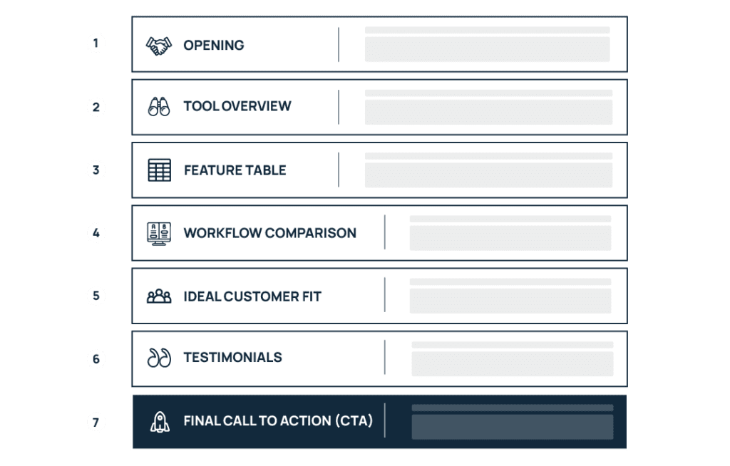
Comparison pages need to make a cohesive and persuasive argument to convert a buyer. This means using a clear structure where each section answers a specific question your buyer is likely to have while evaluating tools. By the end of the page, they should be able to synthesize the key differences, understand how each option fits their needs, and feel confident moving forward with a decision. These pages also work best when connected to related content within a content cluster that reinforces your authority on the topic.
Opening Section: Show Buyers You Understand Their Situation
Start by immediately confirming that the reader is in the right place. Avoid long introductions, so visitors know within seconds that the page will answer their question.
Address the concerns that usually drive comparison searches, such as budget risk, implementation time, or whether the tool will fit their workflow. A short opening paragraph that reflects these concerns helps readers feel understood and keeps them engaged.
For example, Klaviyo emphasizes that they are one platform that can pull data from across marketing tools better than competitor Attentive in their headline and opening sentence. They are telling the reader Klaviyo makes life easier by putting B2C marketing data in one place.
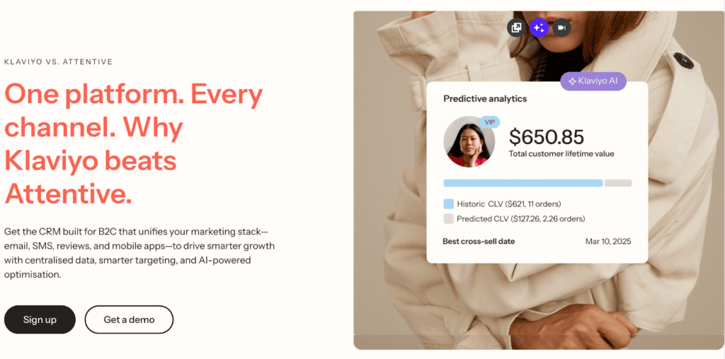
You can also include a quick summary verdict or positioning statement here, as Klaviyo does by emphasizing “centralized data, smarter targeting and AI-powered optimization.”
Section 1: Overview of Both Tools
Next, briefly introduce both products so readers understand what each tool is known for. This provides context before diving into the detailed comparison.
Position the competitor fairly rather than framing them negatively. Honest positioning builds credibility and signals that the page is designed to help your buyers make the right decision, not just push a sale.
Once both tools are introduced, transition into your differentiator. The tone should stay professional and informative rather than adversarial.
Section 2: Feature Comparison Table
The comparison table is often the first section buyers scan, so it needs to be clear, accurate, and visually easy to read.
Organize the rows around real decision factors buyers care about, insights you can often uncover through keyword research, which reveals what buyers actually evaluate when comparing tools.These often include:
- pricing models
- integrations
- onboarding time
- reporting capabilities
- automation features
Include the core features buyers expect in order to purchase, even if both tools cover those needs. But use the table to emphasize meaningful differences in a way people can easily digest, rather than filling it with rows that don’t help buyers understand how the products actually differ.
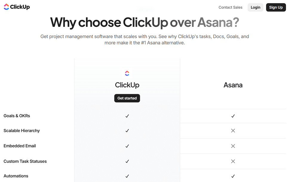
The ClickUp vs Asana comparison page is a good example of a well-designed feature table. It uses clear decision categories, icons and visual formatting to improve scannability, and minimal text so buyers can quickly spot the most important differences between the tools.
Section 3: Workflow & Outcome Comparison
After the table, explain what the differences actually mean in practice. Because buyers aren’t just comparing features, they want to understand how the tools will affect their daily work.
Describe how you approach areas like onboarding, setup time, reporting visibility, or operational overhead and highlight where this differs from competitors For example, you might require more configuration but offer deeper customization, while your competitor might prioritize simplicity and faster time-to-value.
Focus on real business outcomes that show how your product translates into practical advantages for teams using it every day. Here’s Notion’s comparison vs Confluence as an example:
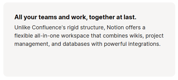
The Notion vs Confluence comparison page shows workflow differences rather than just listing features. These sections explain how Notion reduces context switching by combining tools in one workspace. This helps readers understand the practical impact on daily work, not just the feature set.
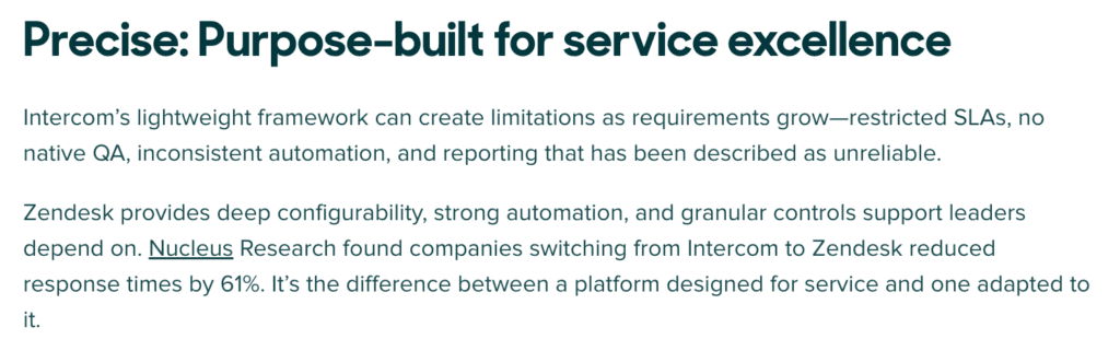
Where you have real numbers to back your claims up, use them, as Zendesk does in their comparison page with Intercom, citing research on response time reduction for those switching from their competitor.
Section 4: Ideal Customer Fit
Not every tool is built for the same type of customer, and comparison pages should make that clear.
Explain which types of companies typically benefit most from each product, including factors like team size, technical maturity, or growth stage. This helps readers quickly determine whether they fall into the right category.
Being transparent about where a competitor may fit better can actually increase trust. Clear positioning helps filter out poor-fit leads while attracting buyers who are genuinely aligned with your product.
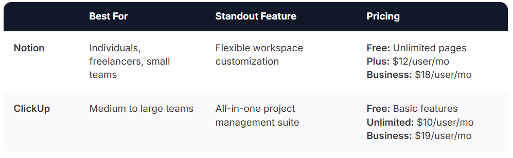
The Notion vs ClickUp comparison is a strong example of clearly defining ideal customer fit. By stating that Notion works best for individuals and small teams, while ClickUp is designed for larger teams needing structured project management, the page helps buyers quickly determine which tool aligns with their team size and workflow needs.
Section 5: Social Proof and Testimonials
Social proof reinforces the comparison by showing how real customers experienced the difference between the tools.
Quotes from customers who switched from the competitor are especially powerful, since they provide direct evidence of why someone chose your product. When possible, include results tied to real outcomes such as faster onboarding, improved reporting visibility, or operational efficiency. For example, Miro has pulled detailed TrustRadius reviews that compare them to competitor Mural:

Testimonials can appear throughout the page, but it’s also helpful to include a short section that highlights a few standalone quotes from relevant customers, ideally from similar industries or company sizes.
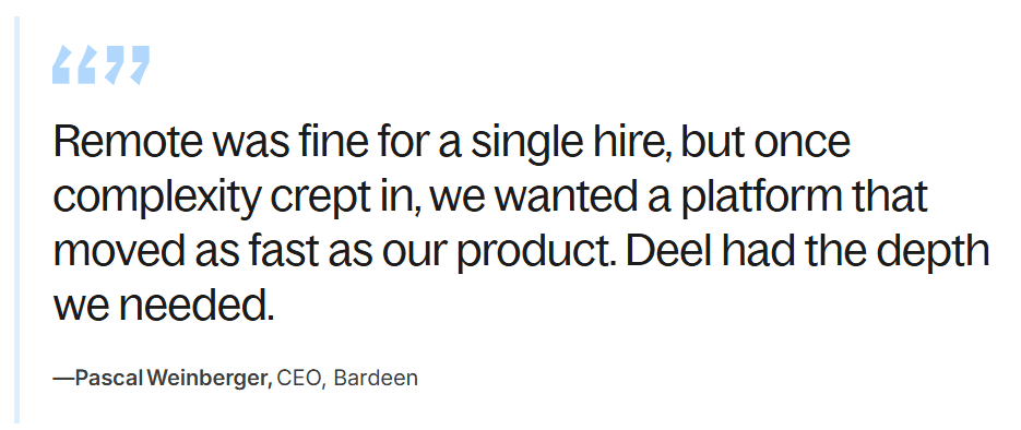
The Deel vs Remote comparison page uses testimonials to reinforce the comparison with real customer experiences. Quotes from companies that switched tools help illustrate how the differences between the platforms impact real operational needs as teams grow.
Section 6: Clear, Contextual CTA
The final section should guide the reader toward the next step in their decision process.
Match the call-to-action to the buyer’s readiness. For example, “Start Free Trial” works well for product-led tools, while “Book a Demo” is more appropriate for complex or enterprise-focused products. Some buyers may simply want to review pricing before taking action, making “See Pricing” another effective option.
Right before the CTA, briefly reinforce the product’s main differentiator so the reader clearly remembers why your solution stands out. This final reminder helps convert high-intent visitors into qualified leads.
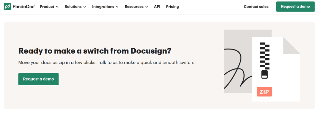
PandaDoc’s CTA follows the same principle of matching the next step to the buyer’s readiness. Right before the call-to-action, the page reinforces PandaDoc’s advantage by highlighting how easy it is to switch from DocuSign, reducing the perceived friction of migration. The CTA “Request a demo” then guides high-intent visitors toward the next step in the decision process, so teams can see the platform in action before committing.
Bottom Line: How to Write a Comparison Page That Converts
Comparison pages sit close to the moment of decision, which makes them far more influential than most informational content. When done well, they shape how buyers evaluate options, clarify where your product truly wins, and remove friction that can slow down deals.
They also reflect clear positioning that directly mirrors how sales and marketing communicate your product, strengthening your pipeline and better qualifying your prospects.
If you want your content to attract the right buyers and drive real revenue, Singularity Digital can help. We work with SaaS teams to turn strategic content into qualified pipeline. Contact us today to book a free call to see how we can help.